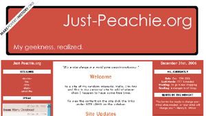
#7. Version: Red
I wanted a three collumn layout because it was easier to access the sidebar content. Red is my favorite color and I thought it was a strong shade especially with the title in white. The subtitle changed every now and then. Definitely a favorite :)
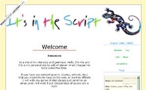
#7. Version: Gecko
Very similiar to the previous layout, but was modified for spring and summer. The colors were happy and the layout was simple.
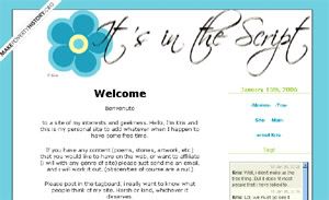
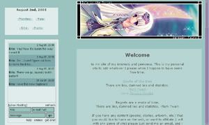
#6. Version: Blue Flower
I liked the simple blue flower, and fell in love with the font. Was up for the 2005 fall/winter season.
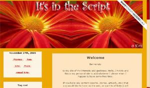
#5. Version: Flower
This layout was a very quick one, but stayed for several months. I just found a basic picture of a red flower and flipped it horizontally to match the other side. I loved the colors and it was a nice change from the usual calm tones.
#4. Version: Faerie
I stayed with a sort of green; I was inspired to use this theme when i saw the picture. A bit small but very efficient. I added the border to make it bigger. Photoshop elements.
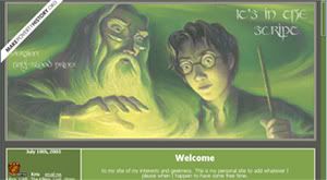
#3. Version: Harry Potter and the Half-Blood Prince
I really wanted to make a layout with the cover because i very much like using green in my layouts. And this is as green as it gets. One of my favorites, it stayed up for a few weeks.
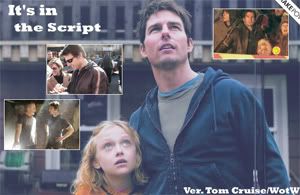
#2. Version: Tom Cruise/War of the Worlds
Photoshop Elements, in anticipation for the release. It wasn't up for very long. First layout under the new site name "It's in the Script."
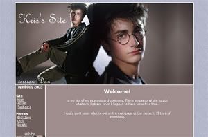
#1. Version: Dan
I created this layout using Photoshop Elements. My inspiration was finding an image site, Veritaserum, and deciding i should use some of it's pictures because they were of such great quality. The purple just happened.